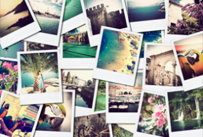
I’m here today to make you aware of an uncomfortable truth.
In fact, I get the impression that it’s become so ingrained in your head how to do things that what I’m going to tell you right now is going to seem a little backward. The fact is that if you’re aligning your visuals with your content and not the other way around, your images and videos aren’t working as hard for you as they could be.
Now, admit it – when you sit down to write your copy (or when you order an article or landing page from your copywriter or custom writing service), you write first and add visuals later, right?
Here’s what’s wrong with that approach…
Your images are the first thing that people see. It’s true in ads, it’s true in web content, and it’s true on any kind of promotional page – landing pages, squeeze pages, whatever. With that in mind, it makes sense that you would want the copy to line up with the images, not the other way around, right?
So how do you do that? I have several suggestions that will help you.
1. Think “Story from Pictures,” Not Just “Pictures in a Story”
At the time of this writing, fall foliage, Halloween, and Thanksgiving are huge topics. We’re getting all kinds of requests for content for leaf peepers.
Now, let’s say you know the type of article you want to write about fall foliage. Before you write anything, you should be looking for the right stock images or videos that will align with the main points in the article. Why? Because if you write the article but can’t find appropriate images, you’ll be forced to use any semirelevant image to emphasize the point. When you settle for the wrong image, your message lacks congruity.
Now, let’s just say your article is going to be about fall foliage weekends in New England. Before you start writing, it would be a good idea to gather a few relevant images or stock videos. If you intend to use three images in the article, download at least five or six. Ten would be better.
Why would you need all of that? Because you want those pictures to be the basis of the story. If your article is about a family weekend or day trip, there should be at least one picture of a family. The trees and fall colors, however, are the real stars of the show so you will want to include images of a few different scenes. Are you writing about rural or urban locations? Are you writing about one specific state? Gather images of relevantscenes then decide which ones fuse together in the best way to tell your story. Look at it as a storyboard with a beginning, a middle, and an end.
2. Place Your Images for Maximum Effect
Image placement will vary with the type of article or content. In an article about fall foliage, you might want to lead with images then tell the story. The right picture gets into the reader’s mind and holds his or her interest, which, in turn, keeps him or her reading. In a “how to” type of article, you might want to lead with the instruction then follow up with an image that illustrates the “how.”
The effectiveness of sales pages can often hinge on image placement, too. Are you selling a physical product? You might want to place images in a central location or use several images of the product throughout the page to illustrate its value in tandem with the text. If it’s an information product, what is the benefit to the reader? What problem does it solve? You might want to acquire visuals that emphasize the problem as well as the solution.
3. Size Matters
In the Game of Content, either you win or you die. Sorry, I had to go there. The point is that balance is key – find the balance between your visuals and your copy, and you’ll have a powerful marketing combination that will hold people’s attention. Miss the mark, and your bounce rate just went up.
Think about a time when you clicked through to a page only to be bombarded with huge images that meant nothing to you out of context. If your images push your copy below the fold (in other words, they fill the screen on a computer or phone with no other visible content), it won’t be anywhere near as effective as it would be with a headline or paragraph that explains why the reader is seeing the image.
People don’t put one thing on their plate, eat it, then serve themselves something else. A great meal allows the diner to sample the protein, the starch, and the vegetables at the same time. So it is with great content. The meat of the page is in the copy, but without the sides (visuals and page formatting), it’s nowhere near as attractive… and probably won’t be consumed in the same amount.
OK, enough metaphors. You no doubt get what I’m saying. It’s not enough to just slap on a few semi-relevant visuals. You need to start with the visuals and work the copy around them, both in words and in presentation. Get that right, and it will add a new and exciting dimension to your content.
